Kinesiomed CTB
Movement · Recovery · Performance

Client

Kinesiomed CTB
Borgosatollo, Brescia

Scope

Logo Design · Brand Identity · Merch Design · Web Design

Year

2025

Kinesiomed CTB — Logo construction board
01 — The Brief

Where the Body Meets the Brand

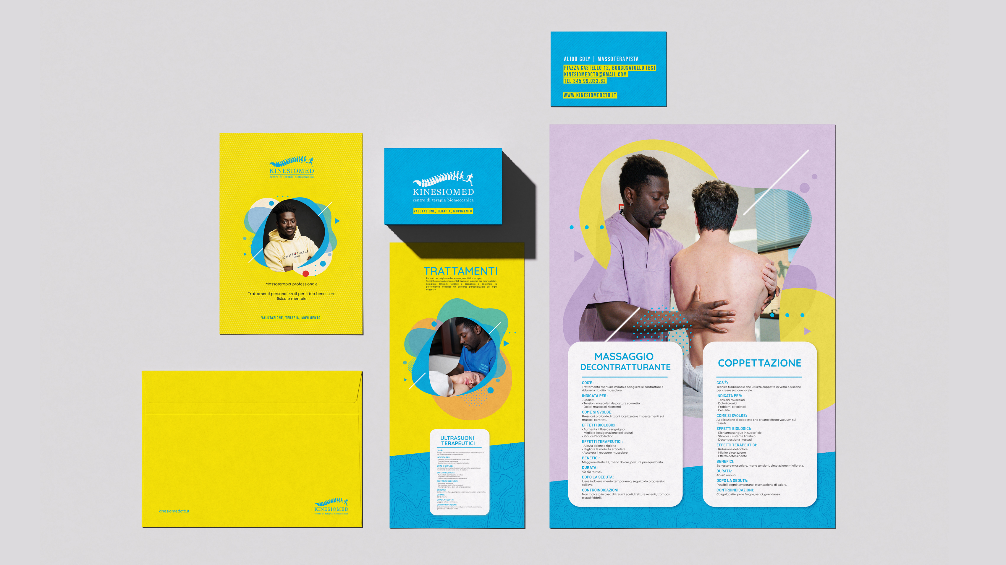
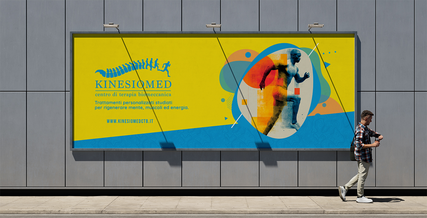
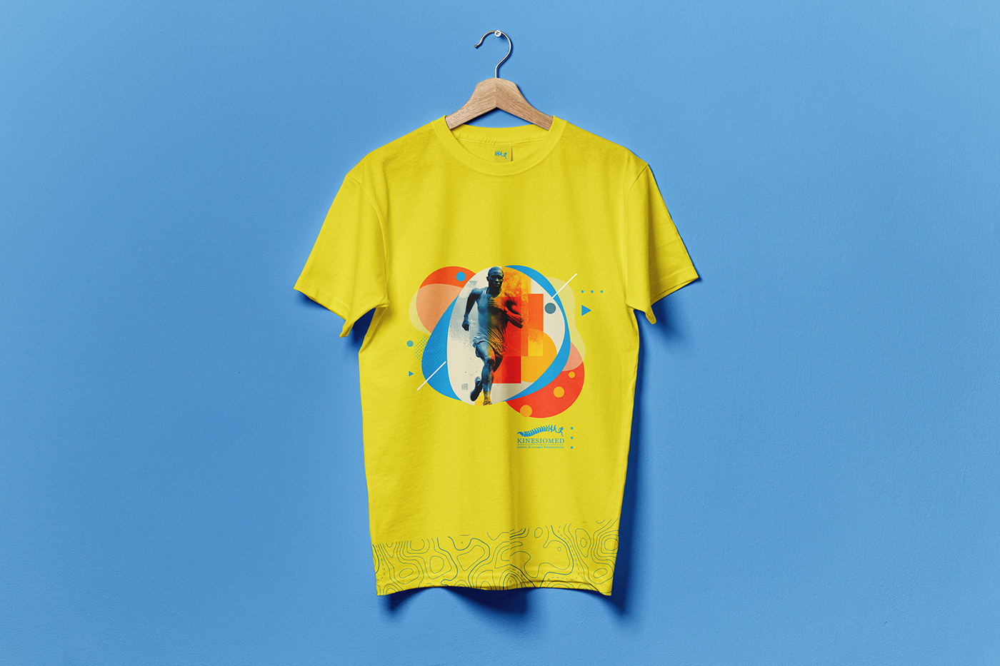
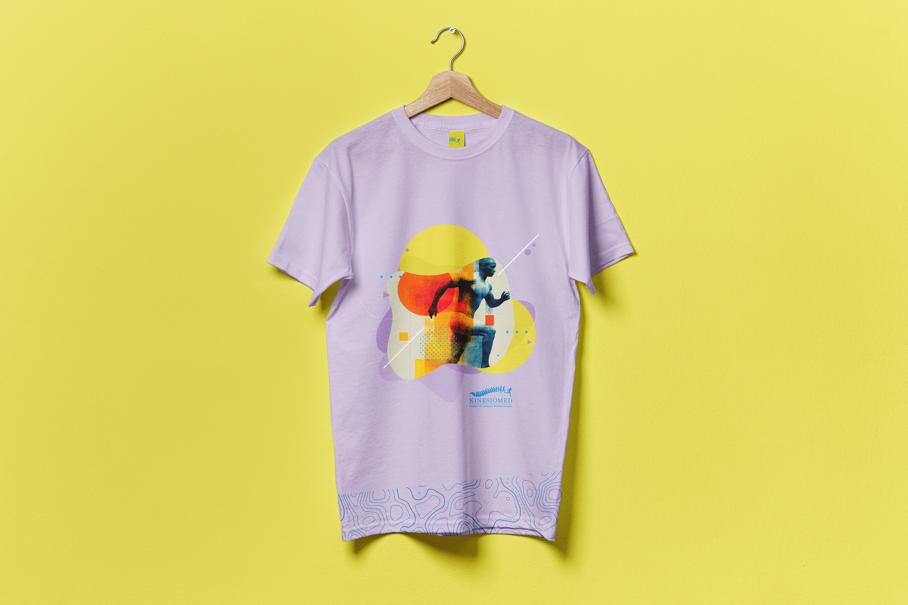
Two connected briefs, one visual world — and one very specific challenge. Kinesiomed CTB is a biomechanical therapy centre based in Borgosatollo, Brescia, specialising in manual therapy, postural rehabilitation, and sports performance. The brief called for a complete visual identity: logo, coordinated image, informational posters, a looping monitor presentation, and a website.

The challenge was to communicate both clinical precision and human movement — a centre rooted in science, but centred on the person.

02 — The Logo

A Spine in Motion

The logotype draws its form from the spine — the structural core of the human body and the symbolic heart of biomechanical therapy. Through a gradual transformation, the vertebral column becomes a running figure: rigour turning into freedom, structure into movement.

The construction board maps every proportion: lumbar curvature, intervertebral spacing, kinetic progression — from anatomy to action in a single mark. The result speaks to both practitioner and patient — technically grounded, immediately human.

Kinesiomed CTB — Complete brand identity system Kinesiomed CTB — Billboard
03 — Brand Identity

Bright by Design

The visual identity breaks deliberately with the clinical aesthetic typical of healthcare — no cold whites, no sterile greys. The palette is bold and unapologetic: electric yellow and vivid cyan, warm organic shapes, dynamic geometric accents.

The choice reflects Aliou Coly himself — a young, talented massotherapist with a naturally warm and energetic personality. The identity was designed to feel alive, welcoming, and human: a studio where professionalism and good energy coexist without contradiction.

Informational posters, letterhead, business cards, and envelope — every touchpoint carries the same vibrant tone, making Kinesiomed instantly recognisable and genuinely different from anything else in its category.

04 — Merch

The Brand in Motion

The identity extended into merch — a yellow t-shirt and a lilac variant, both carrying the brand's running figure graphic. Worn by the team, given to loyal clients, worn at events: the brand literally in motion.

Kinesiomed CTB — Yellow merch t-shirt Kinesiomed CTB — Lilac merch t-shirt
"From the spine to the finish line — a mark that moves as the body does."
← Prati Assicurazioni Frittanza →