1. Brand Purpose & Positioning
Railab Srl is an innovation hub specializing in cutting-edge robotics and automation with over 15 years of industrial experience. The brand positioning required a visual identity that felt both established and visionary. The goal was to communicate “Fair Technology”—innovation that is powerful yet human-centric, balancing industrial strength with digital intelligence.
2. Design Decisions:
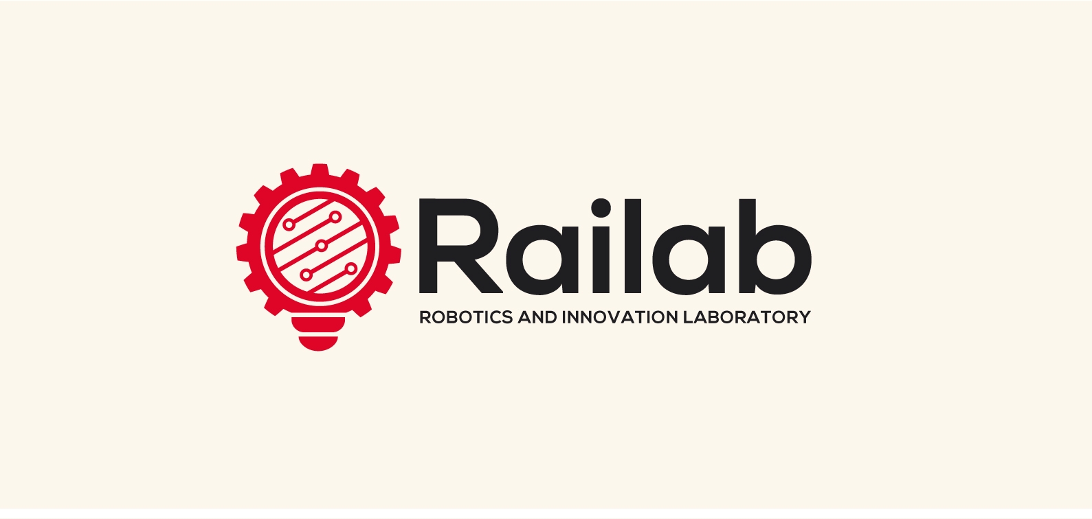
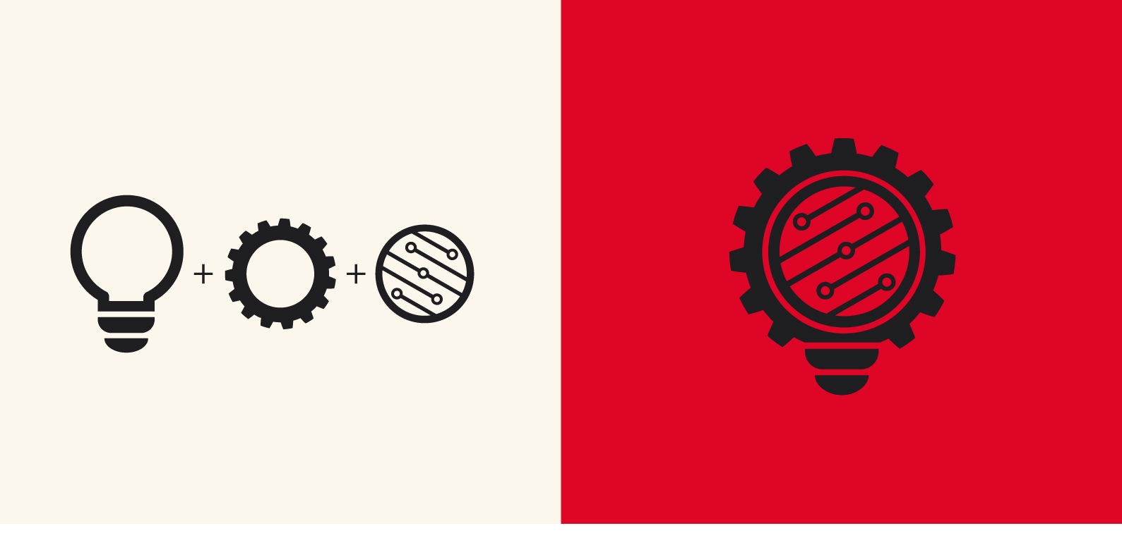
The Symbol: A Triple-Pillar Synthesis
The pictogram is a custom-engineered mark that merges three distinct concepts into one cohesive icon, avoiding generic templates:
- The Lightbulb (The Idea): Positioned at the core, it represents the initial spark of intuition and creative problem-solving.
- The Gear (Mechanics): The outer silhouette communicates industrial reliability, precision engineering, and the physical reality of robotics.
- The Circuitry (AI & Electronics): The internal lines represent the digital “brain.” It signifies how Railab gives life to mechanics through Artificial Intelligence.
- Reasoning: This synthesis tells a complete story: every Railab solution starts with an Idea, is built with Mechanical excellence, and is driven by AI intelligence.
Color Palette: Energy vs. Sophistication
- The brand utilizes a bold palette of Industrial Red and Cream, with the primary logo rendered in Solid Black.
- Red: Chosen to command attention and evoke the energy and dynamism of the tech sector.
- Cream: Strategically used to soften the “aggression” of the red, providing a sophisticated, human, and balanced feel that aligns with the concept of “Fair Technology.”
- Black: Used for the logo itself to ensure maximum authority, timelessness, and high contrast across all technical applications.
- Typography: Bespoke Functionality
- Selection: A customized Sans-Serif font.
- Reasoning: The typeface began with Roboto as a foundation due to its clean, mechanical legibility. However, I modified the letterforms to better harmonize with the geometric weights of the pictogram. This customization ensures the wordmark is unique to the brand and perfectly adaptable to various scales.
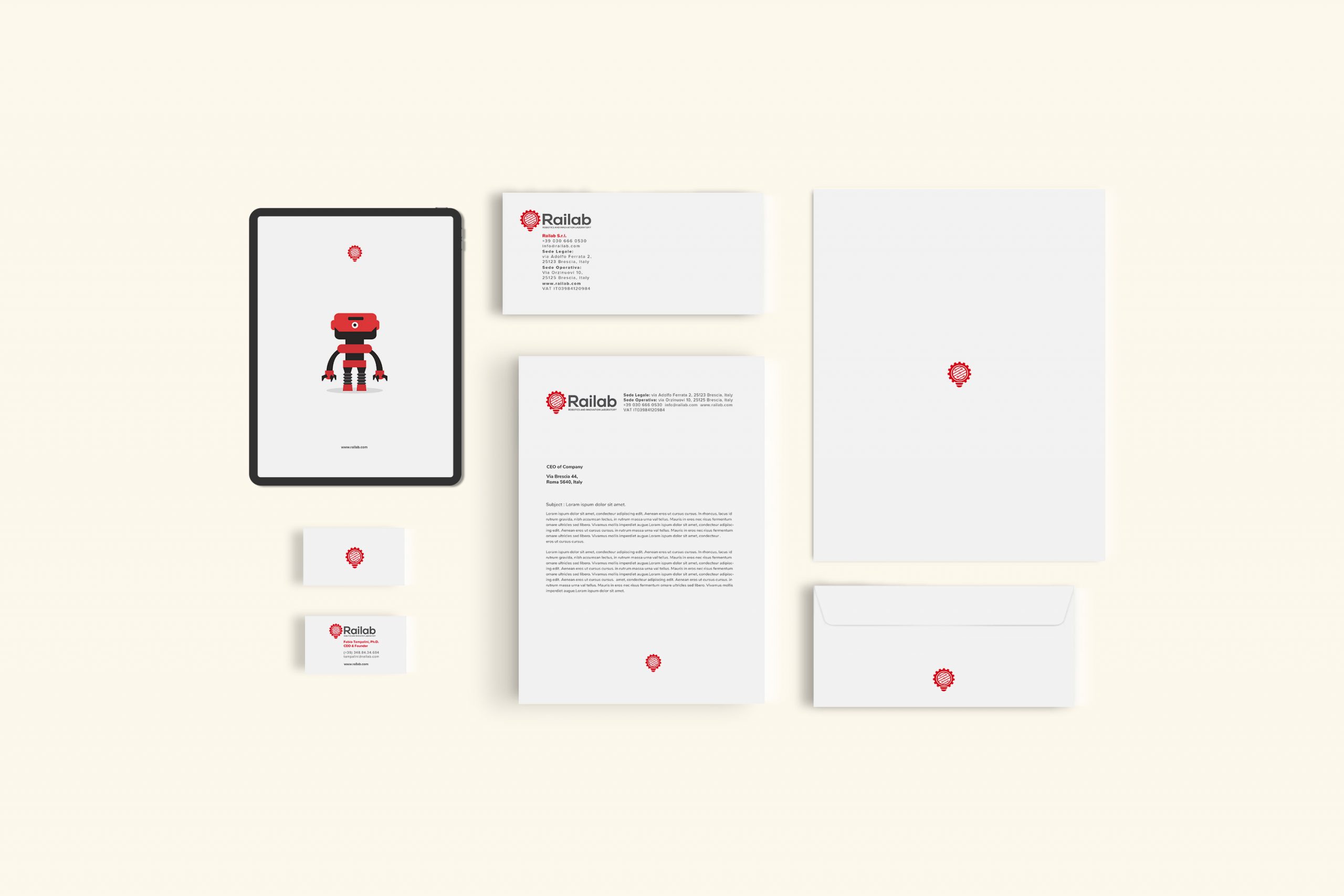
3. Brand System & Scalability
- Understanding that a logo must perform in the real world, I developed a comprehensive Brand White Paper (Guidelines).
- Adaptability: The logo was stress-tested for diverse applications—from small-scale digital favicons and PCB (circuit board) silk-screens to large-format industrial machinery panels.
- Consistency: The White Paper defines clear usage rules for different layouts (horizontal, stacked, and icon-only), ensuring the Railab identity remains professional and recognizable across every touchpoint.
4. Extended Visual Identity & Brand System
- Beyond the core logo, I developed a complete Coordinated Visual Identity to ensure a unified and professional voice. This included the design of stationery, digital assets, and a specialized visual library for corporate presentations.
- The Brand Character: Humanizing Technology
- A key element of the brand’s storytelling is a custom-designed Character Mascot: a small, charismatic robot.
The Concept: The robot was designed with subtle visual nods to the company’s founder as a playful tribute.
- The “Why”: While Railab operates in the high-tech B2B sector, the character breaks the coldness of traditional industrial robotics. It humanizes the company, making complex AI presentations more approachable and memorable for clients.
Presentation Design & Engagement
- To support the sales and engineering teams, I created a modular system of visual elements for company presentations.
- Consistency: Every slide uses the established grid, the custom typography, and the Red/Cream/Black palette.
- Storytelling: The character is integrated into these presentations to guide the viewer through technical data, creating a narrative flow that is both professional and engaging.