Complete branding for a fried fast food restaurant inspired by the 1980s paninari movement.
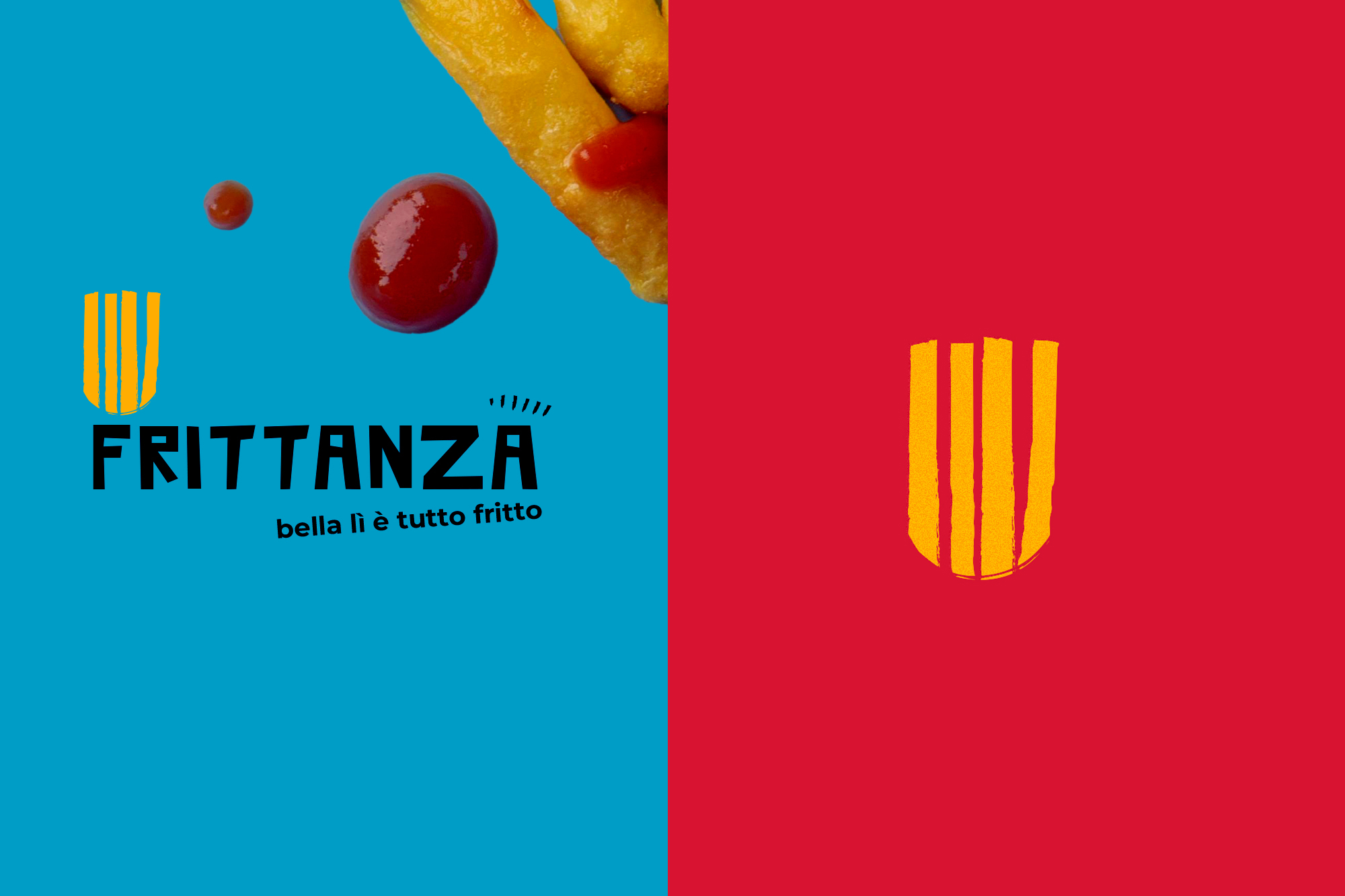
Naming & Copywriting: Frittanza was chosen to instantly evoke fried food and a lively, informal vibe. The payoff “Bella lì, è tutto fritto” adds a playful Milanese touch.
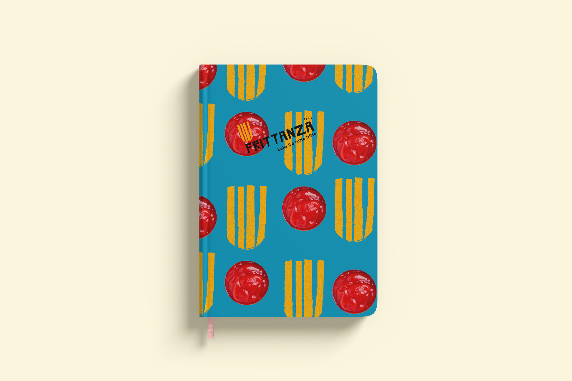
Logo: French fries doubling as a punk crest, blending retro rebellion with modern design.
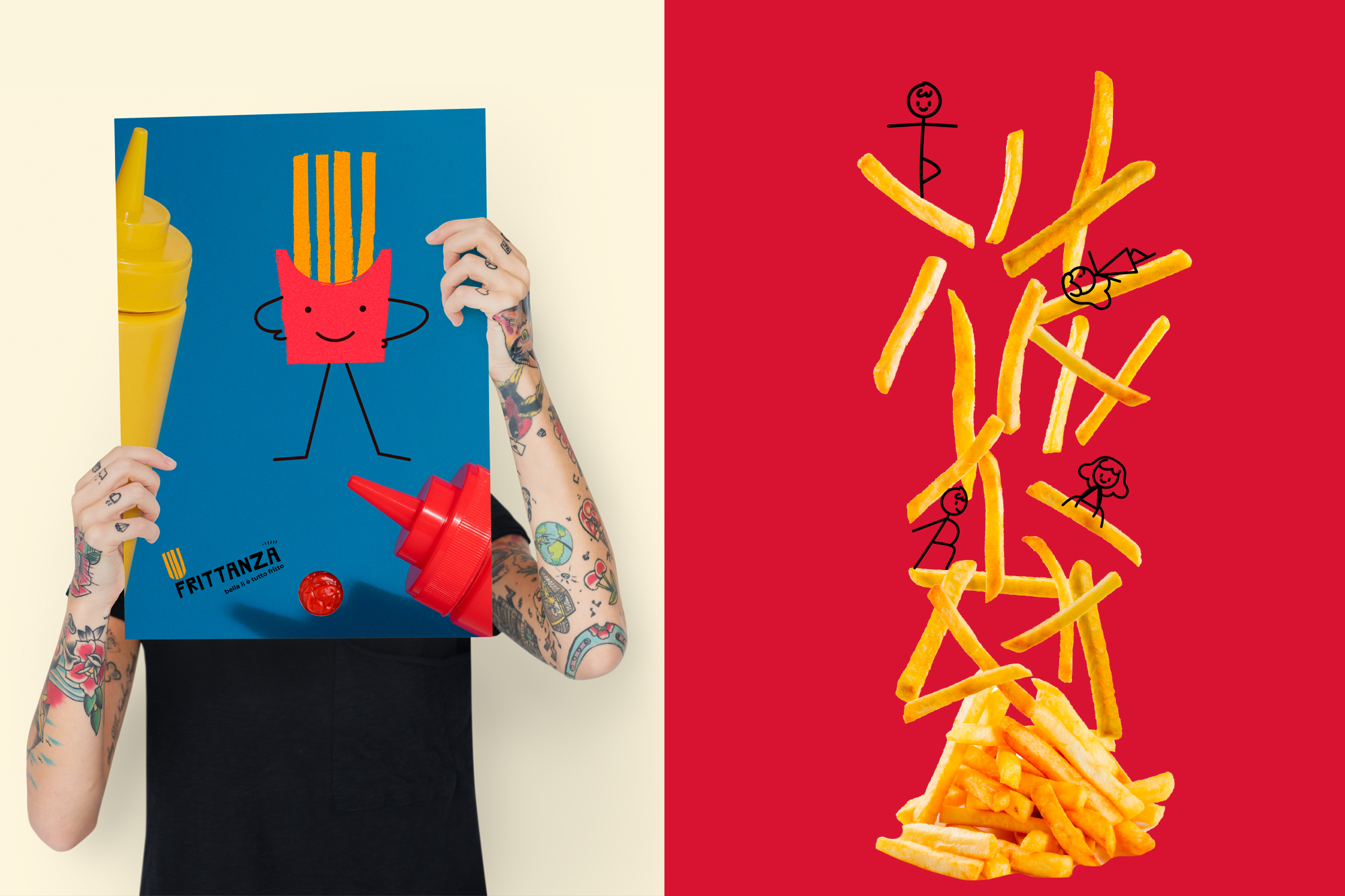
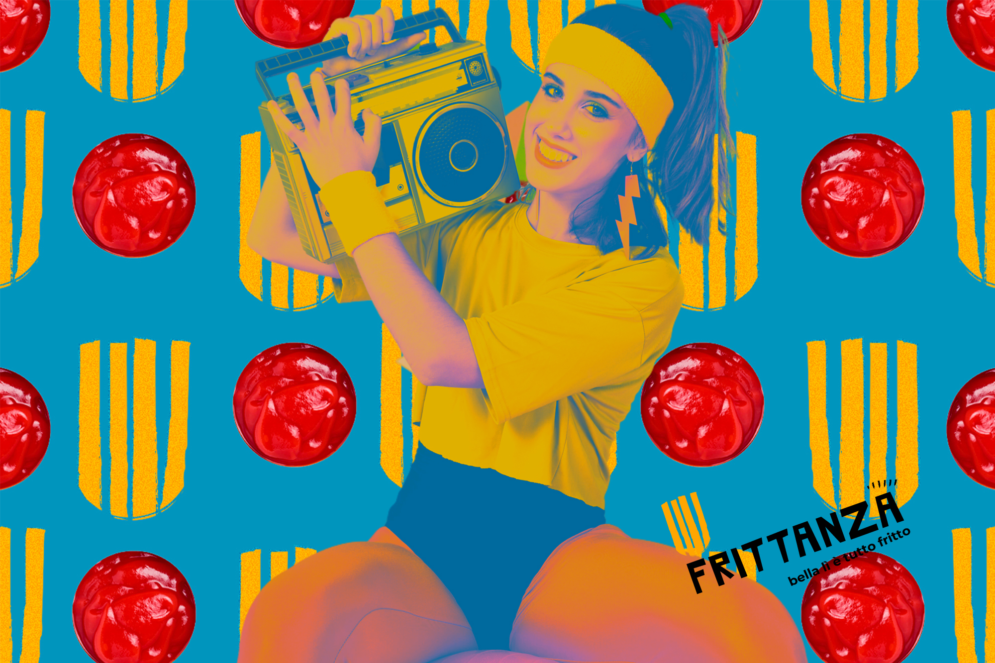
Visual Style: Bold neon colors, geometric patterns, and retro fonts recreate an authentic 80s aesthetic.
The project captures the restaurant’s youthful, nostalgic spirit while delivering a fresh, recognizable identity for today’s audience.